This house has been a challenge and a joy. While I loved the openness of the living area, most of the finishes were already feeling dated - and it came bare bones; no extras- millwork, appliances, the kitchen wasn't complete, and there was no kitchen in the suite downstairs- so it had been on the market for a couple of years. Also, it only has two bedrooms in 3500 sq ft, but did have a space for guests, my work, a den for Brian and it felt really private, even know it's within a pretty tight neighborhood.
But the views...oh
the views. Actually, my first client out of school was in this
neighborhood, so I knew the views were spectacular. And it was new; I
had never owned a new home before- nobody had lived in it.
When we came around the corner, the red
exterior took me by surprise, and it's still growing on me, but as soon
as you get to the top of the stairs inside, the view and the light demand
your attention. Didn't matter about the red floor, granite, fixtures
or the lack of yard space. I could work with them- I needed to have my Nespresso, facing that lake and that mountain range.


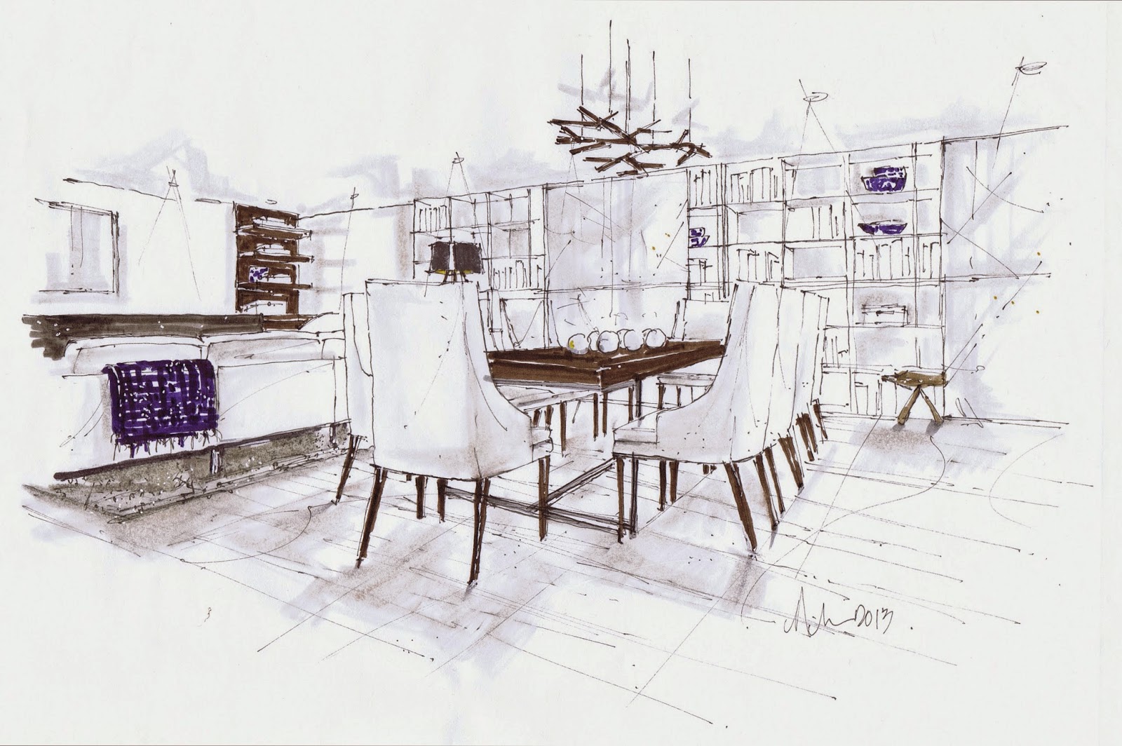
Starting in the Living Room we moved and changed the lighting over the dining table (that area was relocated). We needed to add blinds throughout because of the southern exposure, so I chose standard roller solar shades in an 80% opacity. When the shades are down, you can still see the view. I liked the idea of see-through, so the dining room fixture from Vistosi works great; I used Restoration Hardware filament bulbs; I they work nicely together :)
The corner fireplace is one of my peeves (as well as corner bathtubs)...I dislike them so much...and this one has no breathing room...the windows but right up to it. I tried not to crowd it too much, not to draw attention to it. I plan on doing a wood palette type treatment to the face soon, as I am not a fan of most granite.


Adding on to the kitchen made sense of the wall (and a half) of nothing that the builder left us, claiming it was because then we got to choose what we wanted. lol...I love that one. It really means, I ran out of (or didn't want to spend) money. The hood fan was so 90's - I found a design similar to this new one on Houzz, just a simple sheath of stainless steel I was able to wrap around the existing fan.
It was no easy task to add that one cabinet to the existing kitchen wall...there was a junction box and a heat vent. One wonders if that's why the builder didn't add it himself. The added wall of drawers and shelves were stained the same as the existing (would be way to expensive to change that), The new upper shelves were painted in the wall colour for an open feel. I have lots of white stuff. (oh, and a electrical outlet in my cabinet)
The house didn't come with appliances (well, one black stove to match the black faucet and sink), so we purchased and had installed my favorite Fisher & Paykel dishwasher and fridge along with a Kitchen Aid commercial style range. I had to live with the kitchen lighting, which are large pots, putting the budget into millwork and appliances instead. I may do retro-fit LED kits one day. Not only are the recessed pots large, but also, they don't line up with the cabinets...enough to drive a designer to drink!
I just couldn't bring myself to install more granite, so I will replace it in a couple of years; I chose a Cambria solid surface for the kitchen addition, which I will eventually use to replace the granite.
Downstairs we also installed a full kitchen with appliances, with quartz counter-tops to create a finished suite. That's six kitchen appliances plus hood fan fabrication and installation...ouch said the checkbook.
In addition to the kitchen drawer wall, I added a pantry to hold larger items and then had it all run into a custom banquette. I finished the banquette in a similar dark finish and did custom upholstery with a Robert Allen Contract fabric. I replaced the nook fixture with spots and wide beam spreads on a dimmer (I installed dimmers wherever I could through the house) to flood the space with light. Most homes on the lake offer great views, so I wanted to raise my but up high enough to see that view from the short windows; raising the banquette height to 19 inches.
The Bemz slipcover on the desk chair was one I ordered to try around the dining room table, but I didn't like the quality of the Nils chair for guests to sit in through a long dinner party, so I went with RH Track Arm Chairs in Sand. I bought the desk from my designer friend Karla Amadatsu; it just so happened I was looking for a black desk in these dims, and she had one...I love it! When she sent me the photo, I thought the whimsy of the legs would work with my other pieces. It's a place to use the ipad, make a list, and gives me a place to display some of my favorite things. I got the lamp from Layers and Layers, it's from Arteriors. Layers and Layers also did my drapes in a sheer Joanne fabric and I bought those rope cloches when they were on sale through them and Arteriors.
I had to work with the floor and the tile, and I decided some teak pieces would tie into some of the tones of the floor; actually the sun has faded it a bit over the four years we have been here, so that's good.
The Master Bedroom has some of the best views in the house, but to sleep I installed custom grass blinds, lined with blackout. The spec lighting had to go...please if you are listening contractors, stay away from those 20 dollar flush mount domes...ugly. Also, I changed out the frosted glass dated sconces, which were a match to the entry, nook and powder room fixtures...all gone. We also changed out the lighting in the Master Bathroom, and installed a matching blind over the tub. Don't you love the typical real estate staging..it's like.."look, a
queen air bed can fit here...I am inviting". Why bother? That's not why
we bought the house...lol.


I don't love the slate inlay- kind of Whistler, and a little dated, but when buying a house, you buy it as is. Here's where a finish dates quickly; be careful you don't follow trends when choosing tile. I painted the wall behind with a gray from the floor and changed out the lighting to highlight my Brent Comber disk. I love the size of the entry, but dislike the wood handrails...they should have put the money into wrought iron; they are flimsy. After moving in, and lots of trades going through, the walls got pretty scuffed up, so we painted Cloud White throughout the house.


I didn't want to repaint the bathroom, I wanted to give it some interest, installing this twig paper from Crown Wallpaper. The sink and toilet were pretty standard, so they stayed, but I changed out everything else...the hardware, towel rack, lighting, installed decorative and also functional blinds and changed out the mirror. Yes, this room too, had that wonderful builder "set" of frosted glass pendants...was there a special deal that day at Home Depot?
I think
the trick is to try to live with the items that would cost to much to
change- working with and adding things that will take the focus away from
them.
So I am already thinking of my next project...stay tuned!